
A Brief Windows 7 Review
Overview
This evening I decided to whip out my Evaluation Copy of Windows 7 RC that I downloaded a while back. Considering Windows 7 is now released to the public, I suppose it’s time to post a few thoughts on it.
When I first tried it out a few months ago I was quite impressed with the responsiveness of it. The installation was quick, startup and shutdown was no-nonsense, and the UI seemed to be far more refined than Vistas. Most of this review will be in screenshots, but I do want to primordially emphasize that Windows 7 is definitely a step in the right direction for Microsoft. I think they are finally starting to understand that its all about being implicit, not explicit. It is about putting interface elements where they should be, not paragraphs of text telling the user where they are, that is, where they shouldn’t be.
Windows 7 cleans a lot of the pitfalls of Vista in this area. I think my frustrations with Vista source from the fact that they moved everything around in the Operating System. Suddenly I was stuck when I needed to find an IP address or get to the device manager, or even just to get to My Computer. Everything was renamed and hidden in menus and it was impossible to find what you needed. Windows 7 on the other hand, is just like Vista in that it is the same underlying technology, it uses the same features and the same changes, but with better UI so that you can still find what you need.
Screenshots

For the first time in years, applications are grouped properly in the Taskbar. Of course you could say that this started occurring in XP, but XP only did it when there wasn’t enough space left in the taskbar. At that point, it would combine the windows of an application into a single bar and you had to click on them and then try and figure out which window you wanted. Whatever it was doing, it was doing it wrong and it always drove me nuts. I turned it off every time it attempted to group items. Windows 7 now simply uses the icons in an OS X style fashion. They can be left there as a means of launching the application, or they can be applications that are already open. This has been in OS X since the beginning, and in Mac OS since the beginning of time: Macs switch between applications which encompass the windows. Of course, this is fascinating because Windows 7 is now less windowsy because the focus is on the program, not the window. Interesting.
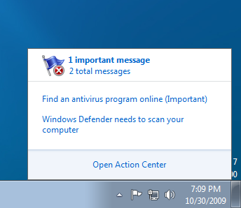
The notification area has also been cleaned up. Icons are less glaring, and seem a lot more soothing. The button-looking thing at the far right is actually “show-desktop” which was surprisingly intuitive. It had an icon on it before, but after I clicked it a few times it apparently disappeared. For the first time since its inception, Windows Security no longer has a tantrum when you don’t have AV installed. It just puts the grey flag in your notify area to let you know. Thank you thank you thank you Microsoft!
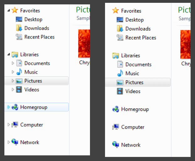
This might have been in Vista, but the triangles that collapse/expand items in Windows Explorer appear and disappear on mouse hover. A nice touch, although it can be distracting at times.
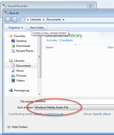
Sound recorder for the first time in recent memory no longer records in WAV.

Part of my testing incorporated IE, since it is part of the Operating System full experience. There was not too much progress in that department though. Still getting annoying pop-down bars about downloading stuff you don’t want that have been annoying the heck out of us since XP SP2.
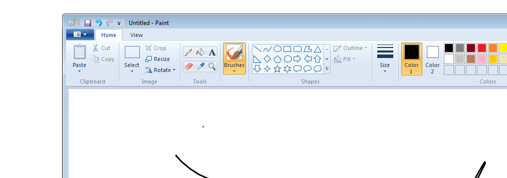
Paint may have had this new ribbon interface in Vista as well, but I wanted to point it out again because it shows some inconsistency. Is Windows moving towards all-ribbon with no menu bar? People have been using menu bars for decades, and while the ribbon is useful, I find it annoying when Internet Explorer does not have a menu bar. More on this later, but I think in this case it works well, since paint is a very tool-based application. The concept of having a toolbox that you can take things out of and use versus selecting things in menus makes sense in this case, whereas in say, notepad, it would make less sense.

While I wasn’t able to try this feature out, “Connect to a Projector” looks promising. This is one of those things that I simply loathe about using PCs. While there is usually some sort of Fn+F5 key combination on laptops that will activate the external display, it is different for every manufacturer, and sometimes it just doesn’t work at all. If this wizard does what I hope it does, that’s a huge improvement to the PC experience.
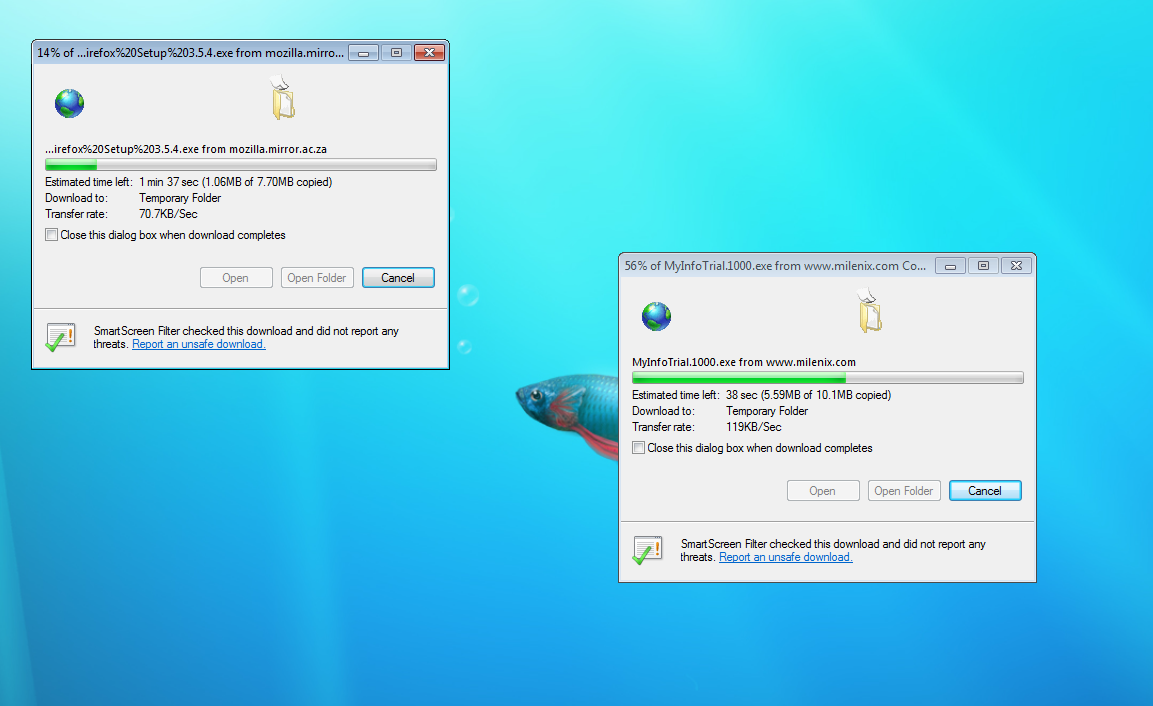
Sadly, IE still does not have a download manager. Downloading more than one file at a time still gives you dialog boxes that stack exactly on top of each other so you cannot even see where they are. You can’t pause downloads either. I remember back when Firefox was still in beta, I was in search of a download manager (I had been using IE) so that I could pause downloads of Linux ISO downloads. Those were the days! So many versions of Firefox later, IE still has no download manager. Come now, get with the program MS.
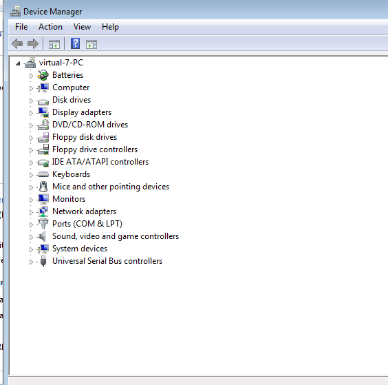
The trusty old Device Manager is still hidden away in system information settings. I’m not sure what to think of this one, since it is useful, but it still represents to me a somewhat depressing driver desert that ruins Windows for me.
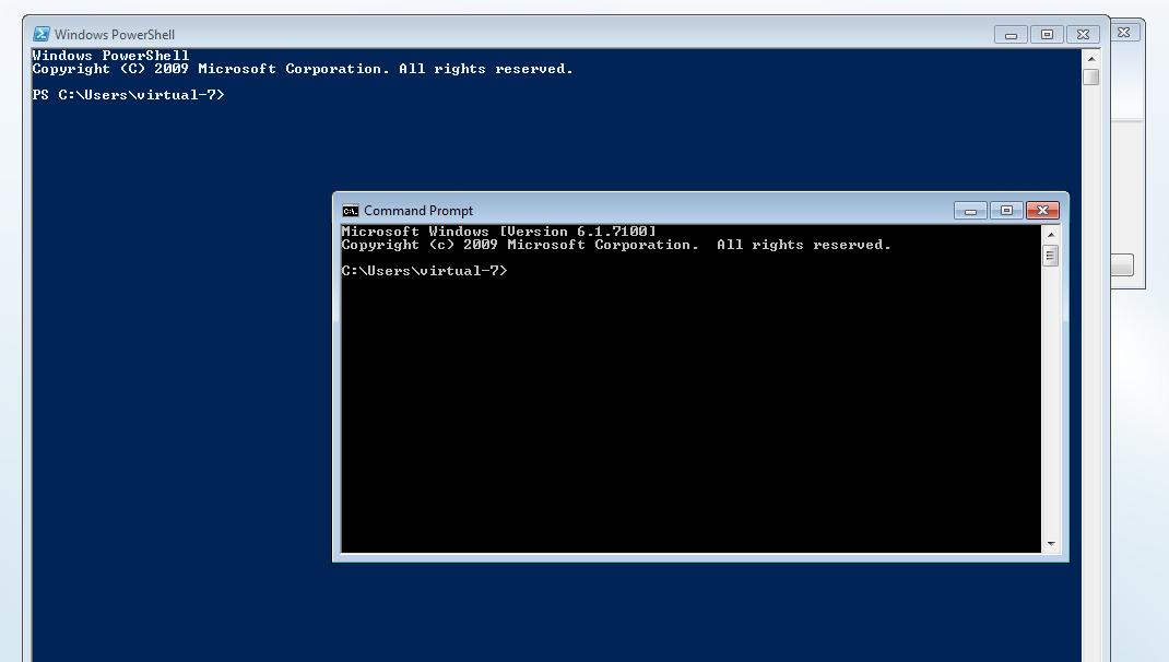
PowerShell and Command Prompt both seem to come standard now with Windows 7. Good to see DOS is still alive and well…
Windows would not be complete without the dreaded svchost.exe and it’s appropriate services. Joy…

This is a useful feature that I’m pretty sure only exited in Word before Win 7. Basically you write in your math and it converts it to the proper symbols. I would probably take my math notes on the computer if it did this well. Unfortunately I’m not sure it would… I was looking for 4/7 not psi/7.

It also seemed to slip up on my 9000 here.
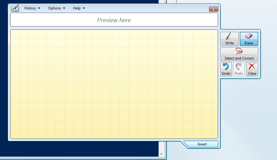
After a while it realized that I probably wans’t using a tablet because of my horrid writing, so it popped out this bar that I hadn’t been able to find earlier.
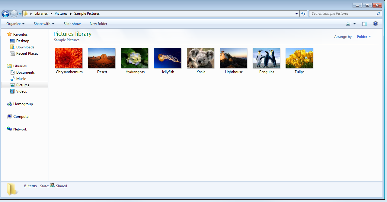
From what I can see, Windows Photo Album or whatever it was called is now totally dead. It was nowhere to be found, with only Windows Explorer in photo-browsing mode in it’s place. This makes a lot of sense, because most photo applications seek to either centralize photos in one location in a giant “separate” library, independent of the filesystem (ie. iPhoto) or do something where it’s trying to still represent the filesystem in some way inside the interface (ie. Picasa, Lightroom, etc.). Both these approaches are problematic because you are either taking the photos away from the user’s filespace or you’re trying to organize the user’s filespace but with the requirement of an external program to do so. It only makes sense to just improve your photo management tools within the file manager itself to make it a viable photo solution.
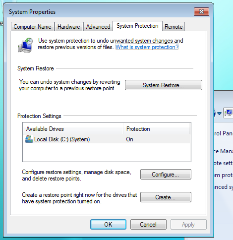
System Restore is now apparently “System Protection,” which makes even less sense than System Restore. System Restore sounded a lot like a backup solution for user files, which it wasn’t, and I’m sure a lot of users got confused by it. Nevertheless, protection makes it sound like it’s somehow actively monitoring your system. Clearly they didn’t think this one through very much (half the UI here is still labelled: System Restore…) but the feature in general was really only useful half the time when recovering a system anyway.
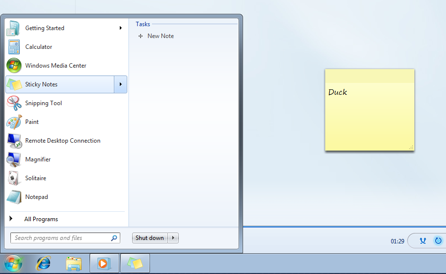
Stickies, another Mac application that has existed since the 80s, has now come to Windows. I was hoping that one’s stickies would shop up in a list under the stickies submenu so you could quickly find a note you had taken, but apparently not. These submenus simply acts as a task list or contextual menu for the application highlighted.
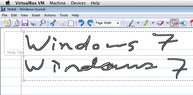
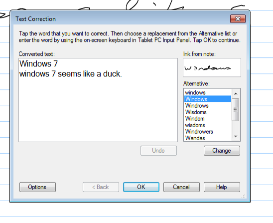
Handwriting recognition seems to have worked out pretty well. Microsoft has been developing this technology for quite sometime now, and it shows. They now have a SpellCheck-like verification which makes a lot of sense.
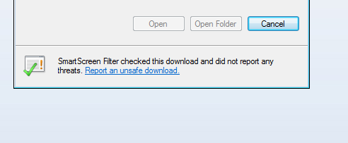
Good thing IE is looking out for me… 🙂

When Apple made the transition from Copeland to OS X, there was a big leap for developers to make. They had to recreate their apps to meet new design standards so that it meshed with the rest of the operating system. It took arguably more than 5 years before the majority of the major apps all followed Apple’s recommendations on application style and usability, but it’s now done and all OS X apps works in the way the user’s expect them to. This means that toolbars work a certain way, Menu bars contain the expected items in the expected places, etc. Copy and Paste is not going to be a different shortcut key in different applications.
In Windows, this isn’t always the case, and Microsoft has traditionally gone with the “reverse compatibility” policy of making sure every app in the past 20 years runs on the latest version of Windows. This stunts the redevelopment of modern software, and as a result, we have the image above. We have a modern Outliner tool that seems to be adopting the Office 2003 look, likely incorporating some sort of toolkit that came with .NET version X.X. Then we have Firefox which is also totally different, although very traditional Menu Bar + Toolbar style, and finally we have Paint, which uses the Office 2007-style ribbon interface with no menu bar whatsoever.
We can’t expect the millions of software applications for Windows out there to somehow agree on a particular style of interface, and most certainly no one interface will be able to accommodate every type of application, but now that Microsoft has “stabilized” the OS a bit by securing it and giving it a modern, usable interface, its time to start getting developers all on the same track.
This is a slow process, but Microsoft should really decide moving forward what an application should look like inside the Windows environment, because right now it seems to be going in just about every direction, and from the programming point of view it’s equally confusing.
Wrap Up
Overall, Windows 7 looks like it has some promise. There’s no doubt that it is simply Vista with new clothes, but that isn’t really a problem because Vista was really just in need of some new threads. Windows continues to be plagued by many problems that it needs to resolve. Inconsistent interface strategies, malware, incompatibilities, and some outstanding annoyances and verbosities still exist, but I’m glad to see that I no longer need to cringe when approaching a Windows PC, just cross my fingers it’s running 7 and push a bit of a sigh of disappointment. I will still recommend buying a Mac over a PC, but I’m glad to see that Microsoft is taking a hint here and stepping up it’s game just a little bit.